[pcomp week 2] Electronics labs, switches, and CHOP TO THE TOP!!!

IMG_0067

This week in pcomp we got our hands dirty with circuits and components.

IMG_0020 IMG_0022

I spent a good amount of time getting to know the multimeter, learning how to measure resistance, voltage and current. One of the hardest parts about it was holding the tiny components, measuring them with the multimeter and trying to take pictures at the same time!

I also started building basic circuits with switches and LEDs.

To do the exercise with the potentiometer, I realized I had to solder wires on to the sensor, so I also learned to solder for the first time. It definitely wasn’t the prettiest solder-job in the world, but it worked.

Applying what we learned in the labs, our assignment was to make a switch. We were encouraged to be creative — “A switch is nothing more than a mechanism to bring two pieces of conductive material together and separate them.”

I decided to make a game.

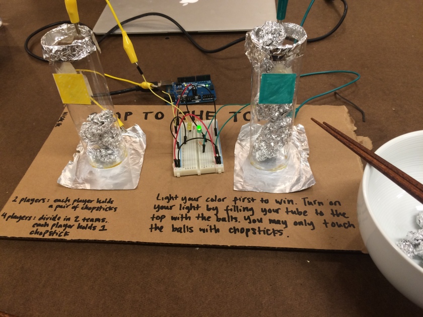
I wanted to do something that tested people’s ability to use chopsticks. I decided to make something that would have two conductive parts with a wide space in between them. The pieces would be connected when people moved other conductive things together in between them so that the circuit could be completed, at which point a light would turn on.

In order to encourage people to use chopsticks to pick things up rather than push things around, I had to make the space between the two conductive points vertical rather than horizontal on the table. Aluminum foil—cheap and abundant—was my material of choice for conducting electricity. So I made a bunch of balls of aluminum foil of different sizes as the things people had to pick up.

The tubes I used were originally pen holders that I had cut the bottoms out of,  glueing foil at the bottom and the top. I had to test if a bunch of foil balls stacked on top of each other would be conductive enough to connect the bottom to the top, so I first used the multimeter, and then wired up a circuit that made an LED light up.

IMG_0044IMG_0045

In order to make this game a race between two teams, I had two tubes and wired up two switches and LEDs of different colors in parallel on my breadboard. So now there’s a green team and a yellow team.

IMG_0070 IMG_0072

I’m not 100% sure the schematic I drew is accurate, mostly because I’m not sure if the line in the middle is correct. But I think it is?

It started to come together, and I wrote the rules:

Light your color first to win. Turn on your light by filling your tube to the top with the balls. You may only touch the balls with chopsticks.

(2 players: each player holds a pair of chopsticks)

(4 players: divide in 2 teams, each player holds 1 chopstick)

A silly game deserves a silly name, and thus I call it CHOP TO THE TOP!!!

IMG_0054

IMG_0055

And voila. I had Aaron (yellow) and Sam (green) play the game to demo. The LEDs are tiny so they’re a little hard to see, but it works!
 

[icm week 2] The beach

(TL;DR: The final sketch is here!)

Create a sketch that includes (all of these):

  • One element controlled by the mouse.
  • One element that changes over time, independently of the mouse.
  • One element that is different every time you run the sketch.

This week’s exercise builds off of what we learned last week and added more dynamic, interactive and/or moving pieces.

I had an idea to do a sunset scene, where the mouse would control the sun and the rest of the elements would change when the sun went down or up. One of the first things I did (pictured above) was divide the height in two to make horizon. Then I made the ocean by making a large blue arc expand slowly, creating the effect of the tide coming in.

But I wanted the tide to also recede,  so I looked up how to use an “if…or” statement:

[javascript]if (oceanWidth = 800 || oceanWidth = 699) {
tideO = tideO * – 1;
}
oceanWidth = oceanWidth + tideO;[/javascript]

This basically made it so that when the ocean arc reached a certain size, it would get smaller until it reached its minimum size, at which point it’d get bigger again.

I discovered the helpful lerpColor() function, which allowed me to easily make a gradient of colors for the sunset.

Screenshot 2015-09-12 14.33.12

But I also wanted to make the colors change as the mouse (aka sun position) changed. I figured that if I could make alpha—or opacity—a variable, I could make it change according to the y position of the mouse. I ended up making two variables that controlled opacity, one for more intense color changes and one for less.

[javascript] a = mouseY;
b = mouseY/6; [/javascript]

I used these for opacity in my lerpColor() function.

[javascript]from = color(225, 22, 84, a);
to = color(243 – b/2, 255 – b/2, 189 – b/2, a);[/javascript]

I also ended up using these variables in a slightly different way as well — by adding or subtracting values to the rgb codes, I could also make the colors brighter or darker as the mouse moved. So my color variables ended up looking like this:

[javascript]cloudColor = color(218 – b, 240 – b/2, 247 – b/2);
oceanColor = color(36 – b, 123 – b/3, 160 – b/3);
whiteWashColor = color(139 – b, 240 – b/3, 238 – b/3);
sandColor = color(194 – b/2, 178 – b/2, 128 – b/2);
sunColor = color(247 + a, 94 + a, 3 + a);[/javascript]

Screenshot 2015-09-13 20.23.46Screenshot 2015-09-13 20.23.55

The screenshots above show you what it looks like when the sun is up vs when it’s down. I’m happy I was able to make the sky change dramatically, while allowing the trees, sand and ocean change more subtly.

For the element that changes each time you run the sketch, I have two birds moving semi-randomly across the sky. And for fun I added a little crab that comes out only when the sun goes down. I haven’t figured out how to make these random movements less jarring and terrifying, which would probably help make the entire scene a bit more relaxed and chill as a beach should be. Oh well! Maybe it can just be the eternal dusk beach of your nightmares.

Screenshot 2015-09-13 20.39.11

As with last week, I had a ton of fun making this sketch. The screenshot above is just a still, so check out the full thing here.

The code is below.  Continue reading “[icm week 2] The beach”

[pcomp week 2] The design of everyday objects & physical computing’s greatest hits

9793515_orig

This week we read two works by Donald A. Norman: the first chapter of his book, Design of Everyday Things, and  his essay, Emotional Design: Attractive Things Work Better. The first rails against everyday objects that are poorly designed, by which he mostly means difficult to understand and confusing to use. He cites numerous examples, like doors that don’t make it clear whether you should pull or push, the thermostat in his refrigerator, and now-almost-obsolete landline telephones.

Scissors, Norman says, are an example of a well-designed everyday object because their affordances, constraints and mappings allow you to easily form a conceptual model in your mind of how they should be used, even if you’ve never done so before.

His essay is a response to some criticism in his book that makes it seem as though he values usability over all else in design—beauty, in particular. His response clarifies that it’s not what he was trying to say, and that designing with people’s emotions in mind is equally important.

These readings make me wonder about the cultural influences in what makes something considered easy to use, or beautiful. I was recently in Japan, a land well-known for its design and usability of everyday objects. As a non-Japanese speaker, some things were easy for me to understand: a basket under your restaurant chair for putting your purse, for example.

Others were not. Many ramen restaurants have you order via machine rather than telling it to the waitstaff (pictured above). The idea is great, but I unfortunately lacked the cultural knowledge or reading ability to figure parts of it out—like how you have to put your money in first before pushing the buttons for your order, and that you have to hit the change button to get change at all at the end.

You only have to give any modern 3 year-old an iPad to see how much culture determines whether or not something is easy to use, so I wonder what kind of cultural assumptions are in the background for a person to understand how to use something as seemingly straightforward as Norman’s scissors.

The final reading this week was Tom’s blog post, Physical Computing’s Greatest Hits (and misses). It’s intimidating and inspiring at the same time to see all the types of projects that can be made with physical computing. What I like in particular is a sense of playfulness about most of them. We don’t necessarily have to create world peace with our designs—making someone smile can be a good enough reason to make something.

[icm week 1] Draw a portrait using code

Screenshot 2015-09-09 18.07.42

(TL;DR — See my final drawing here!)

As a person with no experience with either art or programming, our first ICM homework assignment to draw a portrait of our classmate using code felt quite daunting.

But once I jumped in, I had a lot of fun, even though I definitely didn’t go about the process in a particularly efficient way.

I started by doing a (very rough) sketch on paper based on the picture I took of Isabel in class. Then I tried to code her hair using the curve() and curveVertex() functions.

Screenshot 2015-09-06 17.28.18 Screenshot 2015-09-06 18.05.26

This did not go very well. I quickly realized that graphing out my sketch would make it much easier to plot exactly where I needed to place the curves and other shapes.

IMG_9936

Forgetting the existence of graph paper, I drew out a 30 x 20 graph, which multiplies out nicely to my 750 x 500 canvas size. I then redrew my sketch and plotted out coordinates. I made an Excel sheet to quickly multiply my sketched points by 25 to fit my canvas size, which was helpful for both my calculations and for remembering how to use Excel.

Screenshot 2015-09-08 15.28.26 Screenshot 2015-09-08 23.36.03

I’m sure this would have been much easier if I used Photoshop or some other tool to tell me what position each pixel was at, but I went ahead and used the ol’ pencil and paper method anyway. And also a lot of trial and error.

Screenshot 2015-09-09 10.24.12

I still don’t feel like I fully understand how to use curves. More specifically, I don’t fully understand how the “control points” interact with and change the curve. I also still don’t know how to change the angle of a curve in the middle of a long curveVertex() sequence. If you look at my code below, you’ll see that I kind of hacked it by putting a bunch of shapes together in the background.

I also had some trouble with arc() to begin with because in order to get the eyes angled in the way I wanted, I had to remember basic trigonometry. I ended up figuring out that you could multiply the radians in the code, and so the angles of the eyes came out like this:

[javascript]arc(325, 198, 50, 54, PI + ((1/10) * PI), TWO_PI); [/javascript]

And I added some flashing rainbow colors for fun:

[javascript]rainbowColor = color(random(0, 255), random(0, 255), random(0, 255)); [/javascript]

Overall, I enjoyed this exercise a lot and felt like it was a good way to dive in to the basics of programming, and taught me how to look things up and ask questions.

I’m pretty happy with the result!

in (1)

Note: this is a gif version of my sketch so it looks a little weird, but it gives you the idea. See the final sketch here.

The code is below.  Continue reading “[icm week 1] Draw a portrait using code”

[pcomp week 1] What is physical interaction?

After reading the first two chapters of Chris Crawford’s The Art of Interactive Design and Bret Victor’s A Brief Rant on the Future of Interaction Design, the question “what is physical interaction?” reminds me of another question I’ve been trying to answer a lot recently, which is “what is ITP?” With both, it seems that the more you think about it and the more you try to come up with a solid answer, the more inadequate your definition feels.

Crawford addresses this subjectivity, but nonetheless puts forth a definition of interactivity as a conversation “in which two actors alternately listen, think, and speak.” He describes interactivity as something that exists on a continuum rather than in absolutes, and defines it also by what it is not: reaction and participation, for example. Upon first thought, a conversation makes sense to me as a starting point for thinking about how to define interaction. A conversation isn’t static or predictable; it’ll change and adapt according to what each participant says in each turn. Sounds interactive to me!

But does it still count as interactive if there are no humans in the conversation? The video above showing two AI chatbots talking to each other is certainly a conversation (as well as a pretty cool piece of digital technology), but I wouldn’t classify it as interactive because people are not a part of the actual interaction. At least until we consider robots as people, which as far as I know, hasn’t happened yet.

Victor’s rant, similarly, encourages us to consider people when designing for interactivity. This is where the physical part kicks in. His blog post rages against the prevailing vision of the future that’s entirely screen-based, or as he calls it, “Pictures Under Glass.”

“We live in a three-dimensional world,” he writes. “I believe that our hands are the future.”

Physical interaction necessarily involves the body. Of course, as Victor argues, hands are under-considered as tools in design, but we should also think about the ways we can use other parts of the body to creative physical interaction. And to consider this in terms of sense, what else can we use besides touch? It’ll be interesting to design for interaction by sound, sight, smell and taste too.

What makes for good physical interaction? Maybe it’s what McLuhan considers to be “cool media,” or something that requires more active participation on behalf of the person or user to get something out of it. Or maybe it’s the other way around—something that gives you a wider array of output depending on how you interact with it. Like the way that light switch that turns the lights on and off is less of an interactive experience than a dial that allows you to change your lights to all colors of the rainbow.

But does more interaction mean good interaction? Does it make it a better interaction if you end up with stronger feelings about the experience? Or does that just make it better art? Maybe, the best physical interaction is one where the output is an experience tailored completely uniquely to your input, like a conversation. (Between humans.)